Ultimate Guide to Choosing the Right LED Color Temperature (CCT) & Lighting for Every Space
With the rising development of new homes and businesses, the demand for the best lighting solutions is growing rapidly. In the market, earlier there were not ample options for lighting in the market, other than a simple bulb or tube light with one color, but with significant advancement in the infrastructure industry, things with lighting solutions have changed a lot since then. Individuals are investing more emotionally and financially in lighting and the tones of color in their homes, owing to a varied range of options offered in the market. Hence, it’s essential to be concerned about light colour temperature when you’re choosing LED lighting solutions.
In this blog, LED Phantom will help you find the ideal color temperature chart for each area of your home and commercial site.

What is Correlated Color Temperature (CCT)?
Color temperature is the term that denotes diverse shades of white color produced by altered artificial and natural light sources. In Kelvin, the color temperature is measured, which ranges from 1,000 to 10,000. The Kelvin light scale is efficiently used to describe the color temperature of light, how warm or cool a light source arrives.
If somewhere you witness a warm yellow light, just like a sunset or an incandescent bulb, while other lights are cool while like noon sunlight or some fluorescent lamps. We use colour temperature to define the different colours that light can generate. The Kelvin light scale support you match lighting to the mood and determination of a space, warm for relaxation, neutral for everyday activities, and cool for precision and focus.
3 Different Shades of Light
-
Warm White Light: Warm white LED lights make you feel friendly, comfortable, and very amazing. These types of light fall within the 2000K to 3000K color temperature variety, sitting at the lower end of the color temperature continuum, illustrated by an orange to yellow-white glow. The relevance of warm and bright white light is in the kitchen, the living room, and the bedrooms and can be heightened as floor lamps, chandeliers and table lamps.
-
Cool Day Light: This shade of light upgrades the whole look and offers cool daylight to your space, paired with making your home fresh and reviving. Once the color temperature goes beyond 4500K, it is deemed daylight. Cool white bulbs in this scale emit an efficient blue-white light such as natural daylight. In addition, cool-daylight LED bulbs can be applied in garages and basements and are suitable for use in security lighting.
-
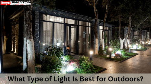
Natural Bright White Light: This shade offers a neutral-white appearance and an invigorating look to your space. The color temperature chart varies from 3100K to 4500K and is classified as ‘cool white’ or ‘bright white’. This range of lights creates a neutral white glow with a slight hint of blue. The application of this shade of bulb is in entryways, bathrooms, and outdoors.
Why Light and Color Temperature Affects Perception, Mood & Use?
Light is not just about switching on or off; it quietly shapes how we focus, how we feel, and how we decode the activities in our surroundings. With LED Phantom, our brains naturally attach various shades of light with signals from nature: warm light feels such as sunset, cool light feels such as midday sun and neutral tones fall somewhere in between. These minor differences modify energy levels, emotions, and even how we associate with a space. The standard color temperature can make a room feel welcoming, strengthening, calm, and constructive, which is why taking the perfect correlated color temperature (CCT) is valuable for both functionality and calm.
Warm Light - Relaxation, Coziness, Ambience
Warm lighting heads a soft, calming glow that naturally influences the body to unwind. It creates the soft tones of firelight and sunsets, which make it best for spaces meant for rest and comfort. Bedrooms, living rooms, hospitality and dining locations often use warm light to introduce an atmosphere of intimacy and calm. Also, such lights reduce visual strain, soften edges, and make color appear richer and more comforting. Whenever the objective is to build a sense of connection, warmth, or relaxation, warm light becomes the most warming and embracing choice.
Neutral & Cool Light - Focus, Clarity, Task Performance
Neutral and cool lighting polishes the visual surroundings, making elements easier to see and tasks calmer to complete. These tones simulate daylight at peak hours, which naturally improves alertness and concentration. Offices, kitchens, workshops, retail environments, and study spaces often depend on neutral or cool light to improve visibility and moderate fatigue throughout focused activities. The freshness of these tones keeps the brain engaged, supports maintaining productivity, and helps accuracy in tasks that require precision. They bring a clean, clear quality to any active space.
How Lighting Influences Color Perception, Comfort & Atmosphere
Color temperature swaps the way we see everything, from wall paint and décor to skin tones and materials. Warm light can make colors look stronger and greater, while cool light discloses sharper compares and truer whites. The unfitting light can make a room feel off-balance or make colors act dull or unfair. Beyond appearance, lighting also figures the emotional atmosphere: too loud and the room feels cold, too dim and it feels gloomy. When paired properly, lighting improves comfort, confirms the room’s purpose, and brings coordination to the visual environment. Good lighting doesn’t just explain a space; it identifies how space feels and how humans interact within it.
Whereas, sometimes when you visit a store and find out that the color looks different under natural light, the lighting of the store may be the prime cause behind it. More precisely, the poor color rendering of the lighting. Color rendering specifically describes how well a light source can present the true color of objects. The Color Rendering Index (CRI) is the most common measure used to determine this performance. Like fluorescent, CRI functioned for conventional lighting sources, but advanced LED technology required a new color superiority scale that could effectively measure the full range of light from LEDs.
What is Color Rendering Index (CRI)?
A color rendering index was the first industry standard, which is also known as a quantitative measure of the ability of a light source to reveal the exact color of different objects in comparison with a perfect or natural light source.
The scale of CRI provides values up to 100, with 100 being the best color rendering light superiorly and figures below zero showcasing very poor color rendering.
With CRI 80+, homes work well, while with 90+, kitchens and makeup areas work well for better color accuracy. Retail environments typically utilize CRI 90+ to ensure products look vibrant of alive. Likewise, with CRI 85-90, workspaces function best as they offer reduced eye strain and clearer visibility for detailed tasks.
Key Takeaways
Newly developed residential and commercial complexes continue to grow, and the requirement for smarter lighting solutions has moved beyond simple bulbs to LED lighting solutions that offer a wide range and scale of color temperatures and visual effects. The Correlated Color Temperature describes the different shades of bright white light from warm, daylight-like hues, and sunset-like tones to cool, and is essential as light always changes mood and comfort the way we perceive colors. The perfect lighting not only presents a room’s atmosphere but also affects the true visible colors, which is where the CRI becomes important.
Lighting Design Tips - Layering, Mixing & Tunable Lighting Strategies
As residential and commercial complexes are developing significantly, likewise thoughtful lighting design goes far beyond picking a bulb. It is all about shaping the character and operationality of a space by merging a range of color temperatures, using fixtures strategically and balancing brightness levels. Once you understand CRI and CCT, lighting becomes a design tool as it is one that lets you highlight texture, improve productivity, create mood, and make colors appear fascinating and natural. An accurate and fascinating lighting plan layers different types of light, enables you to shift tone and brightness as required, and adapts beautifully to how you live and work.
Ambient, Task & Accent Light Layers
Every space depends on only three essential layers. Ambient lighting offers the base illumination and makes the complete mood cheerful, which makes selecting the correct correlated color temperature (CCT) important, warm tones for comfort-driven rooms, cool and neutral tones for heavy activity areas. Task lighting adds the targeted brightness for activities that require clear clarity, including grooming, working, cooking and reading, a higher CRI assists colors and details to appear accurate and crisp. Accent lighting highlights textures, art, décor and architectural features as both LED CCT and CRI make objects look vibrant and true to life.
When to Use Dimmable or Tunable-White Fixtures?
Tunable-white lighting and Dimmable add flexibility that conventional bulbs simply can not match. Dimmable fixtures let the user control brightness to shape the atmosphere – bright for focus, soft for relaxation, without changing the color temperature. They are precisely useful at different locations such as dining rooms, living rooms, bedrooms and hospitality locations where the mood moves throughout the day. Tunable-white fixtures take adaptability even further by permitting you to adjust the color temperature itself. This makes them improve for multi-purpose rooms, classrooms, retail environments, offices and any space where the precise correlated color temperature (CCT) directly stimulates efficiency, comfort and visual accuracy. With the tunable lighting, evenings are warm and cozy, mornings can feel bright and strengthening, and task-heavy moments are crisp and focused. It is one of the brightest ways to associate lighting with the spontaneous rhythm of life.
Common Mistakes & How to Avoid Them
Even with energy-saving lighting options accessible today, a few common mistakes can damage the look and feel of a room. Understanding how CRI and CCT work together assists you in evading lighting that feels distorted, uncomfortable and visually inconsistent. A thoughtful approach settles every space looks and feels inviting, natural and operates exactly as planned.
Ignoring CRI (Only Considering LED CCT)
Different individuals focus exclusively on color temperature and overlook that CRI plays a massive role in how colors appear. A room may have the standard warm or cool tone, but if the CRI is low, objects can look mistaken, dim, or flat. Always check CRI, specifically in retail settings, commercial kitchens, and areas with art and décor, so colors stay vibrant and true to life.
Over-Bright or Over-Cool Light in Cozy Areas
High illumination and cool lighting can strengthen a workspace, but in bedrooms or living rooms, it often feels unpleasant and harsh. Using the excessively cool light in relaxing spaces upsets the calming atmosphere and makes the room feel clinical. Go with the warmer tones and softer brightness levels in spots meant for rest to maintain comfort and ambience.
Mismatched Lighting Across Connected Spaces
When adjacent rooms utilize drastically different color temperatures, the transition can feel visually designed. A warm hallway leading into a cool kitchen, or bright white light in rooms next to a cozy dining area, disrupts flow. Keep connected spaces within a similar correlated color temperature (CCT) range to maintain harmony and utilize the layered lighting to introduce subtle variation without clashing.
Buying Guide / LED Light Selection Checklist
Going with the ideal LED light is easier when you know what to look for. A good selection balances color temperature, brightness, color accuracy, and functionality with the actual requirements of your space. Treat lighting as the part of your interior design as it should complement how you love, how your rooms look and how you want them to feel.
What to Check:
Begin with LED CCT to make sure the light offers the correct mood: warm for cozy locations, neutral for everyday locations, and cool for detail-oriented tasks. Look at CRI to ensure colors will appear natural and vibrant, not washed out. Afterwards, check lumens to ensure you are getting bright enough without overwhelming the room. Consider dimmability if you want control over the atmosphere and verify compatibility with your prevailing switches and smart systems. Finally, go with the ideal fixture type, whether settled, spotlight, pendant, and surface-mounted, to match the determination and style of the room.
Guidance for Smart Selection
Lighting can look very dissimilar in your home associated to a store or product picture. Whenever possible, acquire a sample before committing to a full setup. Assess the light in the actual room, at various periods of the day, to see how it helps with natural light. Pay consideration to the materials and colors in the space, such as floors, walls, furniture, and artwork, which all respond differently to cool and warm tones. And always count the room’s function: the correct LED should help validate how the space is used, whether for working, relaxing, showcasing, and cooking décor.
FAQs
Is 5000K OK for a bedroom?
It’s generally too cool and strengthening. Bedrooms feel more calming with 2700K–3000K.
Do I always need CRI 90?
No. CRI 80+ is fine for most rooms. Pick CRI 90+ only where color accuracy truly matters.
Can I mix warm + cool lights?
Yes, but mix thoroughly. Keep big differences out of the same room and conserve similar tones in connected locations.
What light is best for reading?
Neutral to cool tones around 3500K–4000K, with clear, dedicated light to decrease eye strain.